


As a portland family photographer, one of my favorite things is helping you with styling your spring family photos.
I know it can feel overwhelming to choose outfits for the whole family. I’ve got 5 great tips to make this easier. Read on for help on styling your spring family photos.
1. Think about your photo location
Are you going to a spot that features a specific type of blooming flowers? What colors are going to be out there? You don’t want to blend in with your location but you also don’t want to clash with the background.
2. Color Schemes
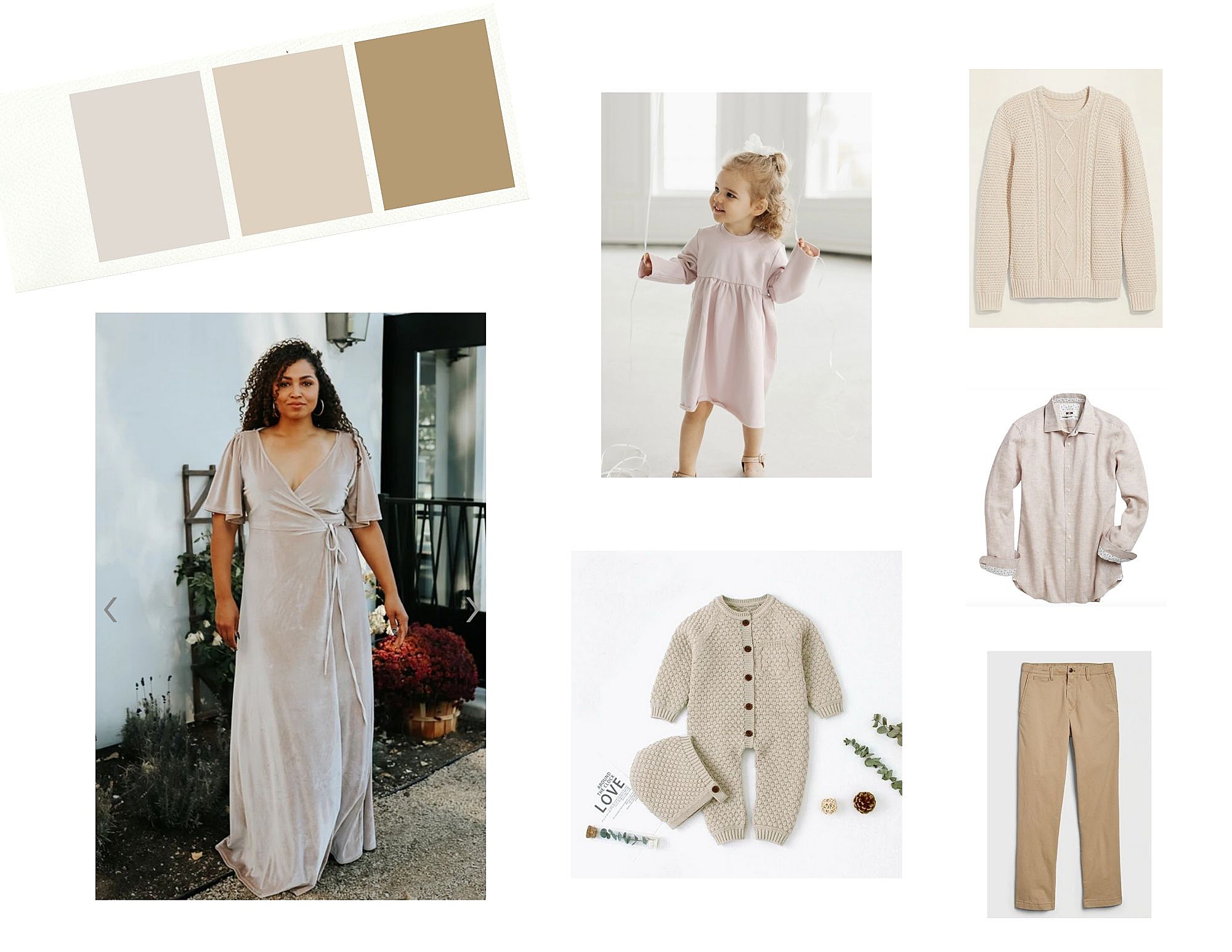
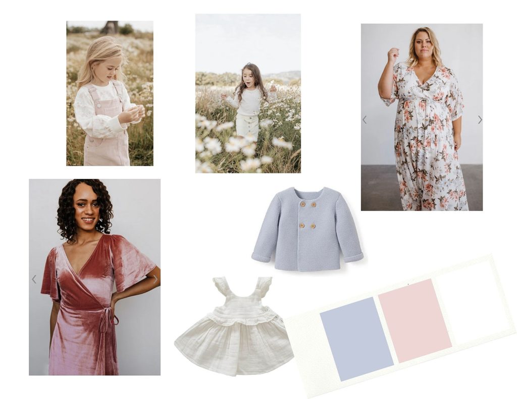
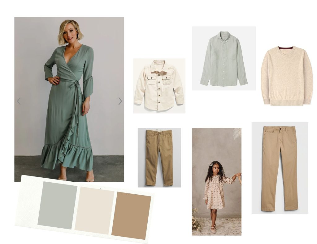
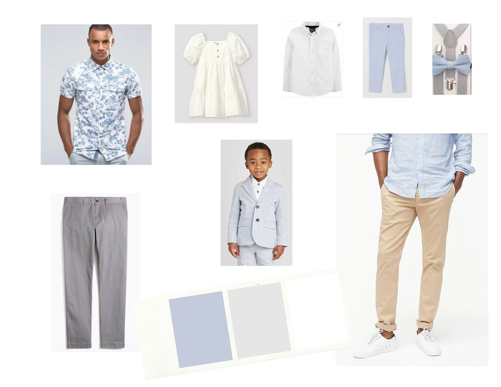
The camera loves sophisticated color. I recommend light-colored neutrals, pastels or jewel tones. Choosing these types of colors will give your images a timeless feel to them. Bright bold colors can be really distracting.
3. Start with your outfit first
If you are planning the photo session, then pick out your outfit first and coordinate the family around you! This will make it so much easier than trying to find something for yourself at the end. I want you to love what you are wearing, so that you love your images. Find something you LOVE and then plan the rest of your family’s outfits around that! (Remember I have a feminine wardrobe you can borrow from as well!)
4. Coordinate – don’t match
You don’t want everyone to be wearing the same thing. Instead create more visual interest in your images by having everyone in a coordinated look. Coordinating your family’s outfits visually breaks up colors and shades so you aren’t all wearing the same color on top and bottom. The more you can mix it up the better! Think about planning each outfit with a “dominant color” and an “accent color” in mind. A dominant color is the color that you see the most and an accent color appears minimally. Each person should have a different dominant color. Family members can share accent colors or they can vary. Think about creating a color palette with your outfits, this will lead to beautiful photos!
5. Go for classic & timeless over trendy
We all know that fashion goes through interesting trends sometimes. Trendy pieces can make a photo cringeworthy 20 years from now. Plan outfits that will stand the test of time.
My goal is to make styling your spring family photos as stress-free as possible. Before your photo session we will get on a pre-planning video call to discuss your outfit options together.
You can show up to that meeting with all of your outfits already picked out and I can share feedback or help narrow down options. Or I can help you come up with a few different ‘looks’ for your family.
Let me help you with all of the logistics so you can relax, and have fun with those you love most!
Fill out my contact form and let’s begin planning your spring family photos!
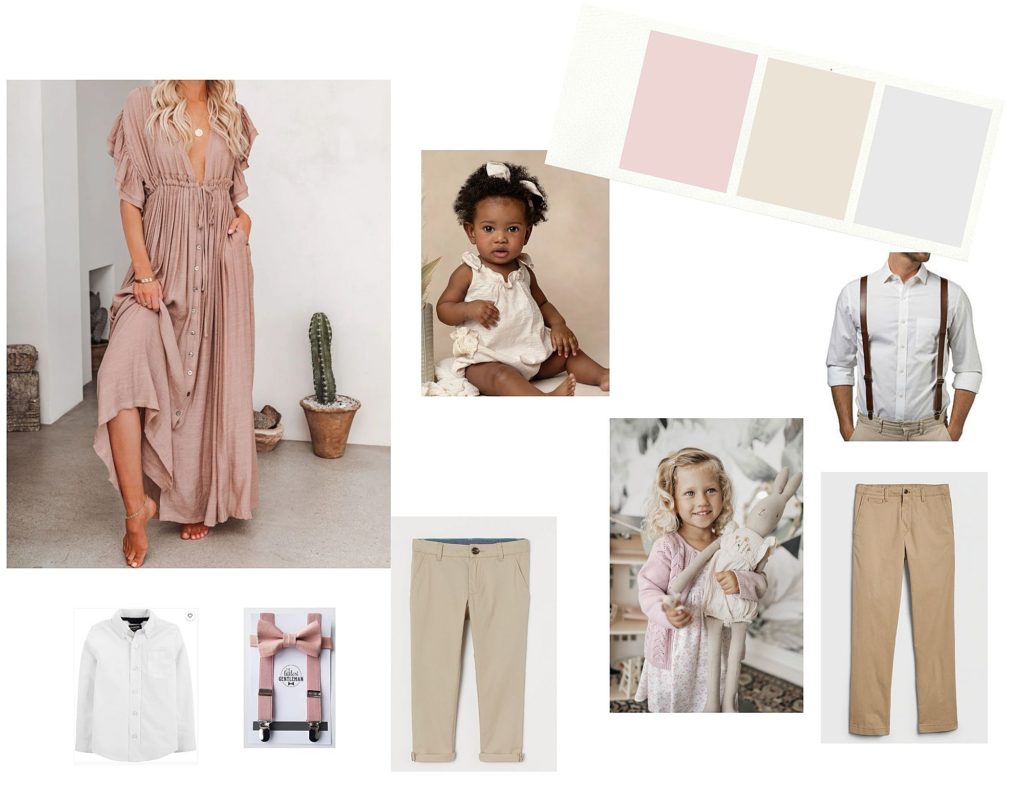
Here are some styling boards for you to look at for inspiration!

Favorite Stores to Shop at:
Moms:
Dads:
Kids:
Leave a Reply


Leave A Comment